Our typography is a visual expression of our voice. Our typefaces build a level of visual texture that adds warmth and depth to our words, helping content come alive in a way that is aligned with our visual expression.
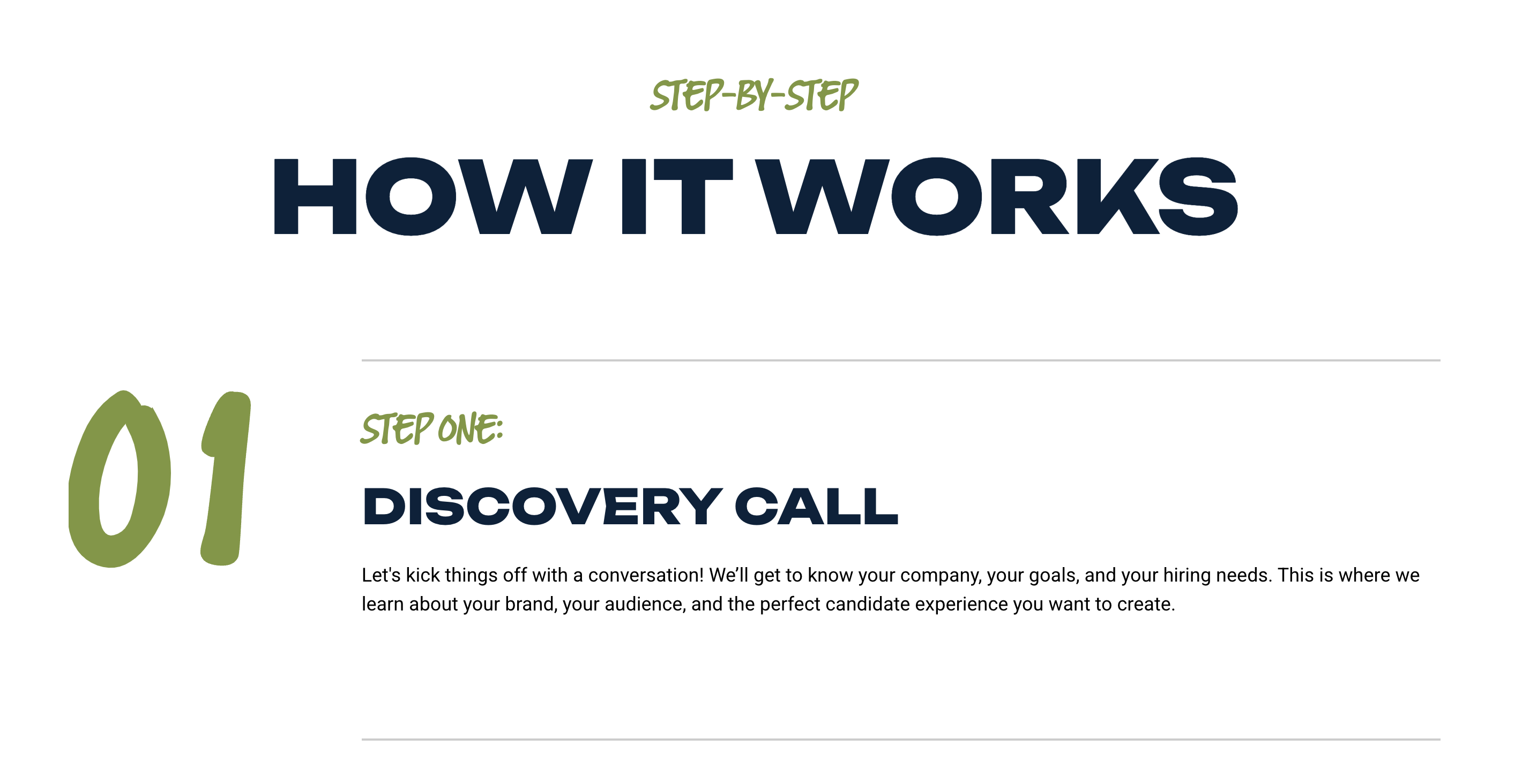
For all headings, use Unbounded. Always in all capitals.
Use Unbounded in the Extra Bold weight. To enhance readability at smaller sizes, opt for the Bold weight or other available weights of Unbounded as needed. This flexibility ensures legibility while maintaining a strong visual presence. Utilize varying weights and sizes to create clear hierarchy between different heading levels, helping guide the viewer’s attention effectively.
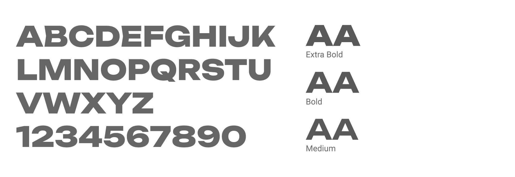
Roboto Normal is our primary body copy font, chosen for its clarity and readability across various sizes and devices. It ensures a smooth reading experience for all content.
While Roboto Normal is the default for body text, other weights of Roboto are available as needed to provide additional emphasis or style in specific use cases.
*Creative Dept. must approve use
Railway Gank is our accent font and should be used sparingly, always in all capitals. It’s ideal for section eyebrows or other areas where a bit of typographic emphasis is needed.