The HireClix logo consists of the wave symbol and the logotype, a custom-designed typographic treatment of the HireClix name. These two elements are precisely positioned and proportionally fine-tuned to create a cohesive mark. Never use the logotype without the wave symbol. If you would like to use the wave symbol on its own, the full logo must also be present within the composition.
To accommodate a variety of applications, we’ve provided two approved configurations—vertical and horizontal. Official logo artwork is available via email request here or by contacting creative@hireclix.com.
Our horizontal, primary orientation should be used most often, as it is the most recognizable and legible orientation of them all. This orientation should always have a registered trademark symbol appended.
The vertical orientation should be used only for small and vertical applications where the primary orientation becomes illegible.

Restricted use, only when brand recognition is very strong or when spaces don’t allow for full logo.
*Creative Dept. must approve use
Our full color logo consists of the gradient wave symbol and the grey and blue gradient wordmark. It is only used on white or very light backgrounds.
On instances where our logo appears on a colored background or a photo, we use an all white version of our logo. Our Deep Sea blue or blue overlay images should be used if possible. Our logo should only be placed on backgrounds where the white logo is fully legible.
*Consult with the Creative Dept. if you have concerns about legibility.
The blue one-color version can also be used in situations that it creates better contrast or provides a more subtle mark. It can also be used when only a single color can be selected for printing. It is only used on white or very light backgrounds.
All margins are equal to one half of the Wave Symbol. These margins must be maintained between the logo and the edge of the artboard or any other graphic element.
The HireClix Help Logo represents our brand’s commitment to supporting client and internal teams with clarity, accessibility, and consistency. The design builds upon the HireClix visual system, using familiar elements with a slight tone shift toward guidance and enablement.
To accommodate a variety of applications, we’ve provided four approved configurations: horizontal (primary), vertical, icon, and combo mark. Official logo artwork is available via email request here or by contacting creative@hireclix.com.
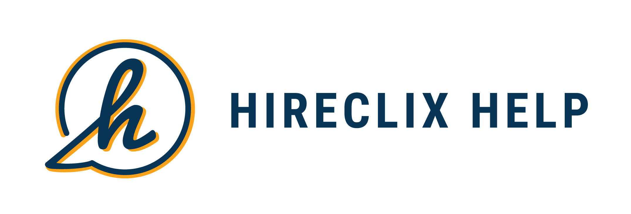
The Horizontal Logo is the primary version of the HireClix Help mark and should be used whenever possible. It offers strong brand recognition and a balanced layout ideal for most formats. If needed in a more condensed space, you may utilize the "Stacked" variation.

The Vertical Logo is designed for narrow or stacked layouts where horizontal space is limited. It is best suited for print covers, internal folder labels, or mobile-centered views that require a vertical orientation. If needed in a more condensed space, you may utilize the "Stacked" variation.
The Icon Mark is reserved for small-scale applications where space is tight and the full wordmark isn't required, such as browser favicons, app icons, or profile thumbnails. Use only when the full HireClix Help name appears elsewhere on the page or product.
Use the Combo Mark for most standard applications where both the HireClix logo and HireClix Help logo are needed for full brand recognition. Ideal for headers, presentations, internal tools, and shared resources where space allows.
Our full color logo consists of the "h" bubble symbol in deep sea & sunrise, and the wordmark in deep sea. It is only used on white or very light backgrounds.
On instances where our logo appears on a colored background or a photo, we use an all white version of our logo. Please use the full-color logo if the background is white. Our Deep Sea blue or blue overlay images should be used if possible. Our logo should only be placed on background images where the white logo is fully legible.
*Consult with the Creative Dept. if you have concerns about legibility.
All margins are equal to one half of the Speech Bubble Symbol. These margins must be maintained between the logo and the edge of the artboard or any other graphic element.